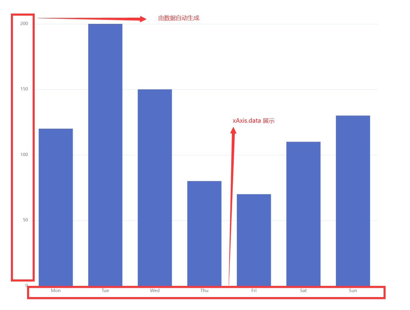
基础柱状图
js
option = {
  xAxis: {
    type: 'category',
    data: ['Mon', 'Tue', 'Wed', 'Thu', 'Fri', 'Sat', 'Sun']
  },
  yAxis: {
    type: 'value'
  },
  series: [
    {
      data: [120, 200, 150, 80, 70, 110, 130],
      type: 'bar'
    }
  ]
};
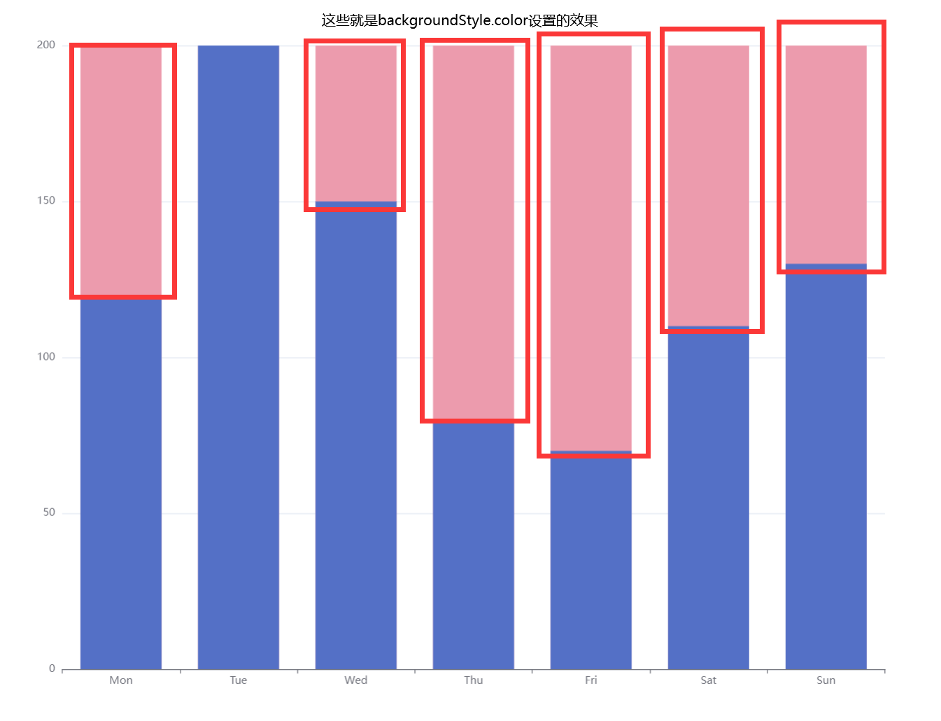
带背景颜色的柱状图
js
option = {
  xAxis: {
    type: 'category',
    data: ['Mon', 'Tue', 'Wed', 'Thu', 'Fri', 'Sat', 'Sun']
  },
  yAxis: {
    type: 'value'
  },
  series: [
    {
      data: [120, 200, 150, 80, 70, 110, 130],
      type: 'bar',
      showBackground: true,
      backgroundStyle: {
        // 设置柱字的背景颜色,也就是空余地方的颜色
        color: '#ec9bad'
      }
    }
  ]
};
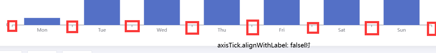
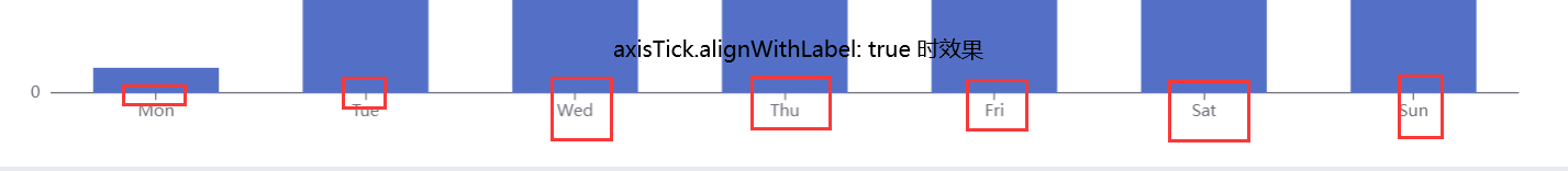
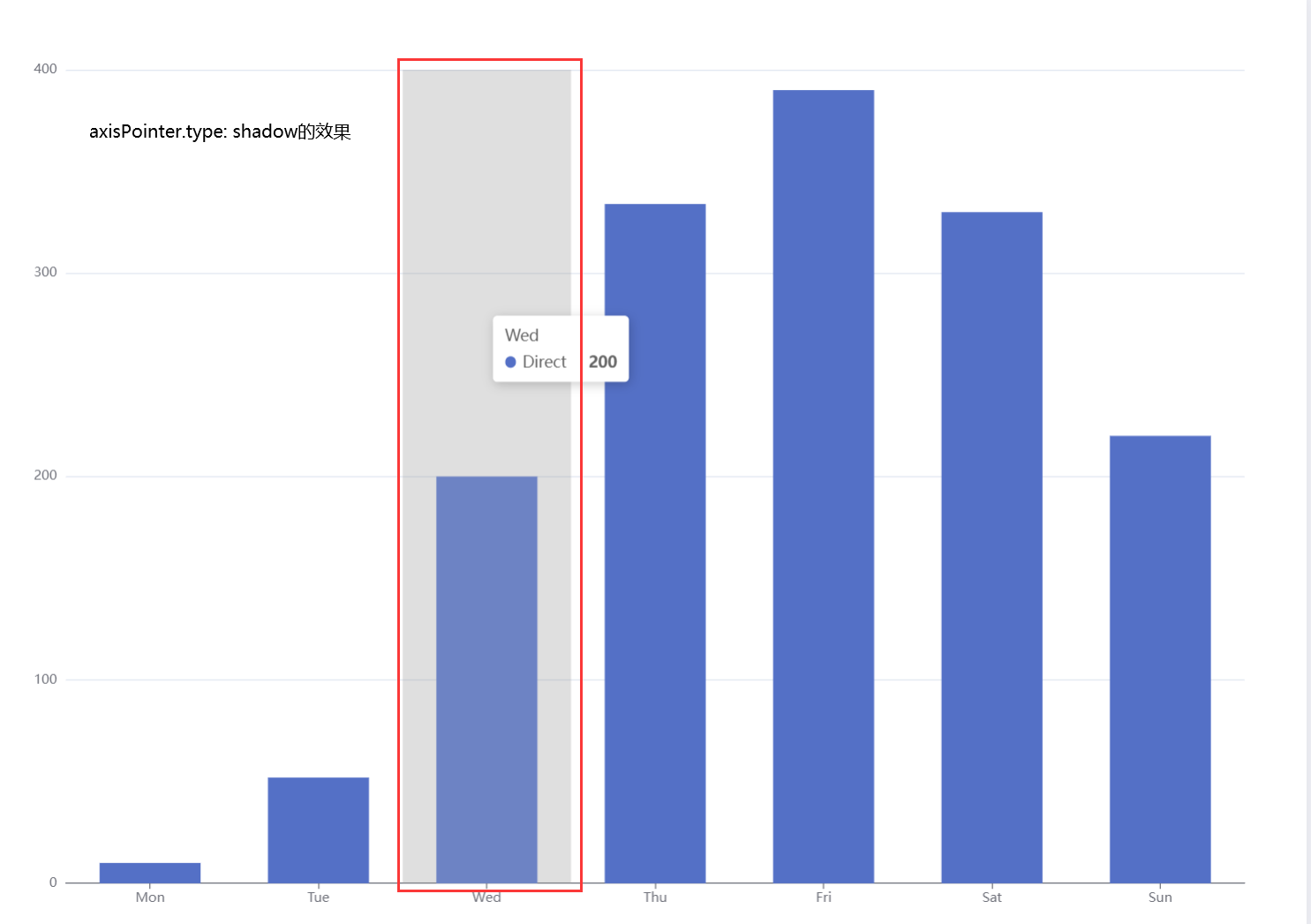
坐标轴与刻度对齐
js
option = {
  tooltip: {
      // 轴线触发,触发之后,以阴影的方式显示
    trigger: 'axis',
    axisPointer: {
      type: 'shadow'
    }
  },
  grid: {
    left: '3%',
    right: '4%',
    bottom: '3%',
    containLabel: true
  },
  xAxis: [
    {
      type: 'category',
      data: ['Mon', 'Tue', 'Wed', 'Thu', 'Fri', 'Sat', 'Sun'],
      axisTick: {
        // 柱与刻度对齐
        alignWithLabel: true
      }
    }
  ],
  yAxis: [
    {
      type: 'value'
    }
  ],
  series: [
    {
      name: 'Direct',
      type: 'bar',
      barWidth: '60%',
      data: [10, 52, 200, 334, 390, 330, 220]
    }
  ]
};
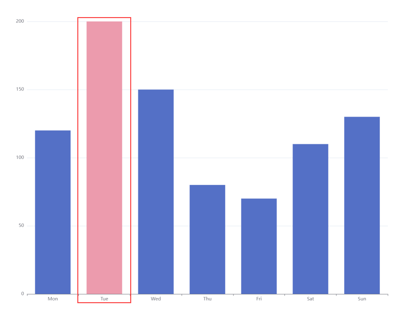
单个柱子颜色不同
js
option = {
  xAxis: {
    type: 'category',
    data: ['Mon', 'Tue', 'Wed', 'Thu', 'Fri', 'Sat', 'Sun']
  },
  yAxis: {
    type: 'value'
  },
  series: [
    {
      data: [
        120,
        // 对值为200的柱形填充颜色
        {
          value: 200,
          itemStyle: {
            color: '#ec9bad'
          }
        },
        150,
        80,
        70,
        110,
        130
      ],
      type: 'bar'
    }
  ]
};
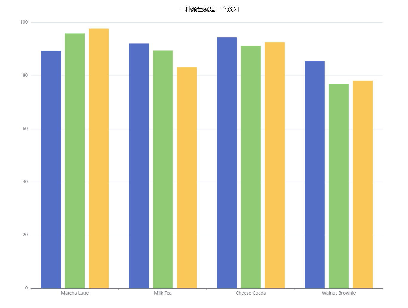
多组数据
js
option = {
  xAxis: {
    type: 'category',
    data: ['Matcha Latte', 'Milk Tea', 'Cheese Cocoa', 'Walnut Brownie']
  },
  yAxis: {},
  series: [
    {
      type: 'bar',
      name: '2015',
      data: [89.3, 92.1, 94.4, 85.4]
    },
    {
      type: 'bar',
      name: '2016',
      data: [95.8, 89.4, 91.2, 76.9]
    },
    {
      type: 'bar',
      name: '2017',
      data: [97.7, 83.1, 92.5, 78.1]
    }
  ]
};